The most fatal illusion is the settled point of view. Since life is growth and motion, a fixed point of view kills anybody who has one – Brooks Atkinson
With another Fed meeting and prospective taper coming down the pike this afternoon, we thought we would frame the question of the times (Are 10-year yields headed higher or lower?) with a bit more historical perspective to what we perceive to be a “settled point of view” in the market.
Recognizing the distinctions between the current Fed who enacts policy from the mystical realm of zero-bound and the more recent committees over the past twenty years that enjoyed such luxuries of a fed funds rate greater than 3.00%, we don’t think most participants grasp how significant a move in 10-year yields was accomplished last year – and how improbable the expectations for a continuation higher is today.
Even when contrasting the bond market carnage in 1994 – brought on by the commencement of an unexpected Fed tightening cycle, the move in 10-year yields over the past year has been twice its magnitude. When viewed as a comparative study between these two time periods (normalized below by the month over month performance) you can see that even during an actual Fed rate tightening period in which the fed funds rate doubled from 3% in February of 1994 to 6% in February of 1995, 10-year yields crested only ~ 40% above the previous years low and started breaking down during the Fed’s final rate hike in February of 1995. To put the move in even greater context, 10-year yields appreciated just shy of 70% from the entirety of the previous cycle low in June 2003 to the cyclical peak in June 2006. This encompassed a Fed rate tightening cycle which took the fed funds rate gradually from 1.0% in June 2004 to 5.25% in June 2006.
Over the past year, with just a posturing shift by the Fed to an eventual curtailment of quantitative measures, 10-year yields crested ~ 80% above the May 2013 breakout.
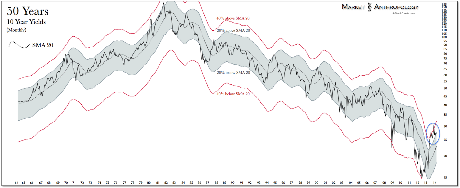
The magnitude of the move in the current yield disposition is lucidly presented below in the long-term chart we’ve posted (ad infinitum) since last December. Simply put, the increase has been greater and more severe than at any period in the last 50 years. With respect to current and future expectations, this development has translated downstream to a market environment which now overwhelming (67 out 67 economist believe rates are headed higher) anticipates the trend continuing and where the impact to the economy – as evident in the downturn in the housing market – has been material.

One of our standing refrains (see Here) since we began publishing our thoughts back in 2011 has been that greater historical perspective was needed when appraising the long-term yield cycle. While we recognize that it’s only one part of the story, we appreciate the unbridled force of nature and inertias it appears to be driven by and the comparatively geologic-time horizons required in understanding its cycle. Greenspan called it the conundrum, predominantly because he had little ability in affecting yields higher. The Clinton administration referred to it as under the influence of bond vigilantes, because they perceived the move in yields as too severe. Both camps were left grasping at straws and we suspect there will be more confusion in the years ahead as we see yields troughing around 2% longer than most would anticipate.