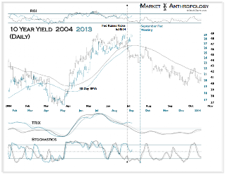
As yields continue to move with all the grace and gentility of your average 800-pound gorilla, we thought we’d revisit our Pole Reversal chart we occasionally reference from time to time to see where things line up.
For those not familiar, the chart below presents the correlation reversal that took place between equities and 10 year yields after the 1998 sovereign debt/LTCM crisis. In essence, stocks went from being anchored by an inverse correlation with yields to a positive correlation. For some, this time period also represents the first salvo in a secular shift in the equity markets from long-term bull to bear.
Extending further out on the theoretical continuum, one can interpret the chart below as not only having a polarity shift, but also an offset mirrored distribution of the negative correlation cycle prior to the summer of 1998.
What?
Think Pangaea – just with a fold along the July 1998 divide.
The interesting thing from this perspective is that the current run-up in yields would be the cycle equivalent of the blowoff in 87′ where yields spiked then recoiled after the equity markets crashed. Although we have been quite impressed with the stock market’s resilience to date in the face of rising yields, the apple cart might have some trouble handling another rapid move.
Judging by the now coiled symmetry of momentum typically representative of a blowoff – that just may be in the cards coming through the fall.
While we’re not calling for another 1987 style crash – the continued rise in yields is the 800-pound gorilla waltzing in the room that everyone continues to stare at.
So far she dances pretty well with the music.