Physical Address
304 North Cardinal St.
Dorchester Center, MA 02124
Physical Address
304 North Cardinal St.
Dorchester Center, MA 02124
 |
| Carlos Slim |
During the final blow-off stage for silver in April of 2011, we caught our fair share of criticism and rebuke for pointing out what appeared to be a terminal run for the silver bullet (see Here). We heard from many of the usual suspects that in one breath marginalized our analysis as nothing more than technical mysticism, then went on to cite truly false and misleading fundamental comparisons as rational for further gains. Rampant inflation, rampant quantitative easing – rampant debasement! With time as the great revelator – mostly rampant ignorance.
With that said and considering silver and gold have languished back towards their late June lows, we thought we’d check back in on a comparative chart we first made in May 2011 after silver had broken down. While we had relied on more acute comparatives as guideposts in the road during the initial break (Here, Here & Here) – we took a broad-brush look at the last great momentum cycle that culminated in the Nasdaq, circa 2000. Not surprisingly, the two assets – both from a momentum and relative performance perspective, expressed notable similarities.
Nearly 30 months out from our initial chart, Carlos Slim’s timely placed hedges on his own silver production appear to have been presciently purchased. And although the magnitude of silver’s decline came up a bit short, the timeline for a mid 2013 cycle low and the structure of the turn (W bottom) still compare closely with how silver has performed today.
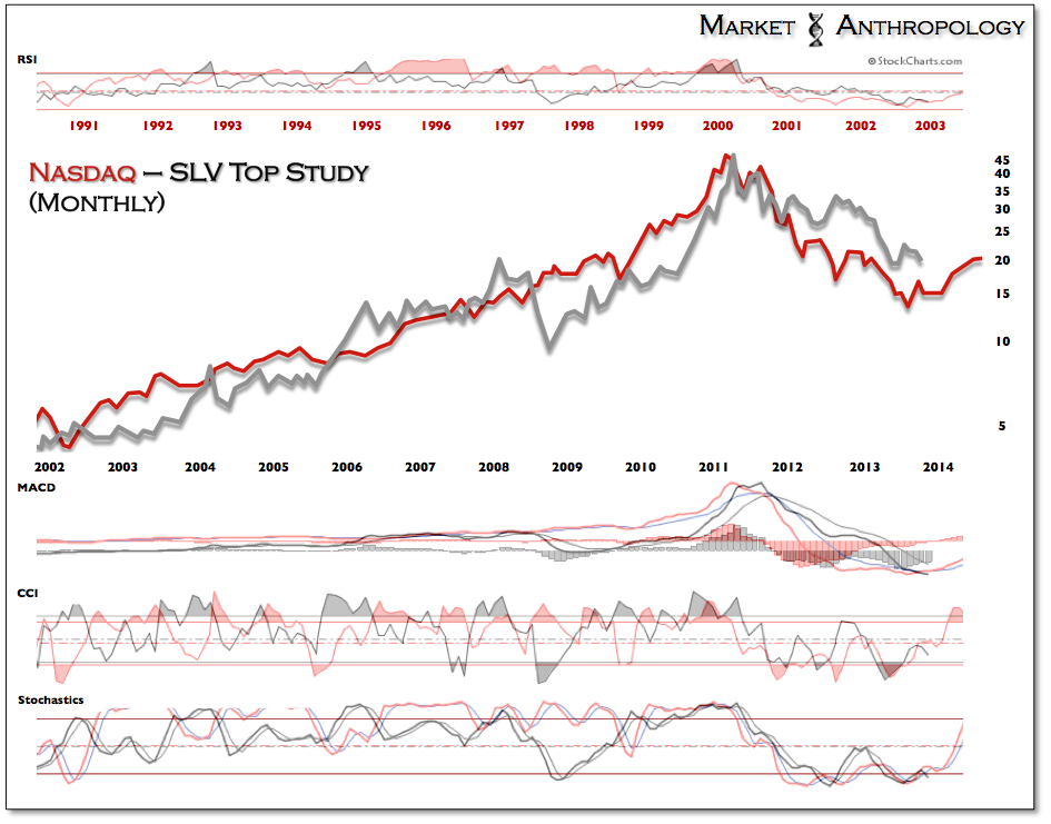
The ratio chart below for silver and gold was normalized by the momentum low prior to each parabolic build – rather than the asset highs of the comparison. Despite this, the concept of the asset cycle and prospective low stands very much the same.

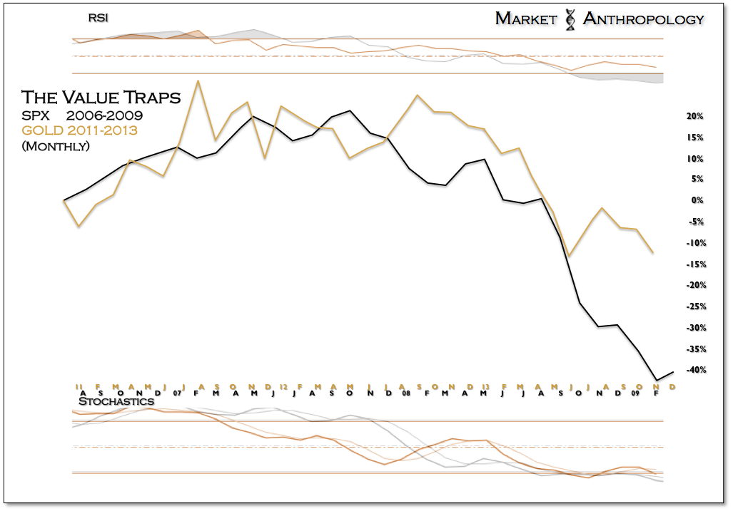
To help validate what we expect will be a major turning point for the sector, we thought we would also check back in on a longer-term performance comp we introduced last January (see Here) between the value traps of the previous cycle (financials) and the miners today. Similar to the Nasdaq chart, the value-trap comparative pointed towards a cycle low for the miners this year – specifically in November.
And although the sector has audibled lower from our more acute comparative work with the banks in Q4 of 2011 (see Here), the timing for a prospective pivot higher now sits in the same seasonal window. Back in 2011, it was directly after the Thanksgiving break that the tax-loss selling for the beaten down asset class subsided and the banks started leading the broader equity market higher into 2012.